


Flyers are a great way to advertise your landscaping business, but it takes more than just a few pretty pictures to capture people’s attention. Typography is an essential part of any flyer design, and it can make or break the success of your advertising campaign. In this article, we’ll explore the role of typography in landscaping flyer design and provide tips to help you create a stunning and effective flyer.
The Importance of Typography in Landscaping Flyer Design
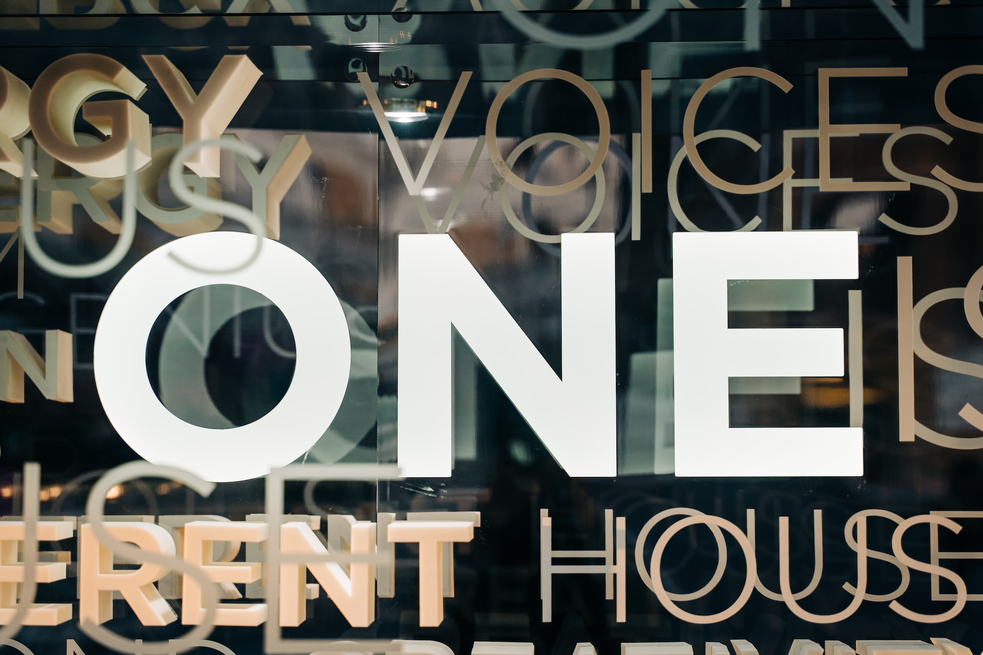
Typography is the art of arranging type in a visually appealing and legible way. It includes everything from choosing the right font to adjusting the spacing between letters and lines. The typography you choose for your landscaping flyer is crucial because it communicates important information about your business and can help you stand out from the competition.
Typography Sets the Tone for Your Flyer
The typography you choose for your flyer sets the tone for your business. If you’re a high-end landscaping company, you’ll want to choose a font that looks elegant and sophisticated. If you’re a more laid-back and affordable business, you might opt for a casual and playful font. Your typography should reflect the overall vibe of your business and attract your target audience.
Typography Affects Legibility
The primary function of typography is to make your text legible and easy to read. If your font is too small, too thin, or too ornate, it can be difficult for people to read your message. Your typography should be clear and easy to read, even from a distance. This is especially important for landscaping flyers, which are often viewed from a distance.
Typography Creates Hierarchy
Your flyer likely contains several different pieces of information, including your business name, contact information, services offered, and call to action. Typography can help you create a visual hierarchy that highlights the most important information and guides the viewer’s eye through the flyer. By using different font sizes, weights, and styles, you can create a clear hierarchy that makes it easy for people to understand what you’re offering.
Tips for Choosing Typography for Your Landscaping Flyer
Now that you understand the importance of typography in landscaping flyer design, let’s dive into some tips for choosing the right typography for your flyer.
1. Choose Fonts that Match Your Brand
Your typography should reflect your brand identity. If you already have an established brand, choose fonts that match your existing logo and marketing materials. If you’re just starting out, consider what kind of vibe you want to convey and choose fonts that reflect that.
2. Use a Maximum of Two Fonts
Using too many fonts can make your flyer look cluttered and confusing. Stick to a maximum of two fonts – one for headings and one for body text. This will help create a clear hierarchy and make your flyer look more polished.
3. Make Sure Your Fonts are Legible
As mentioned earlier, legibility is key when it comes to typography. Make sure your fonts are clear and easy to read, even from a distance. Avoid using thin, ornate, or overly stylized fonts that can be difficult to decipher.
4. Consider the Context
Think about where your flyer will be displayed and how it will be viewed. If your flyer will be posted on a bulletin board, for example, you’ll want to choose a font that’s easy to read from a distance. If you’re handing out flyers to potential customers in person, you might be able to use a smaller font that’s easier to read up close.
5. Play with Contrast
Contrast is an important aspect of typography. Use contrast to create a hierarchy and make important information stand out.
6. Don’t Be Afraid to Use Color
Color can be a great way to make your typography stand out and create visual interest. However, be careful not to use too many colors or to use colors that clash with each other. Stick to a maximum of two or three colors that complement each other and your overall branding.
7. Use Hierarchy to Your Advantage
Typography can help you create a clear hierarchy that guides the viewer’s eye through your flyer. Use font size, weight, and style to create a visual hierarchy that highlights the most important information and makes it easy for people to understand what you’re offering.
8. Keep It Simple
While typography is important, it’s important not to go overboard. Keep your typography simple and straightforward, and don’t use too many different fonts or styles. Stick to a maximum of two fonts and avoid using overly ornate or stylized fonts that can be difficult to read.
9. Proofread and Test
Before finalizing your flyer, make sure to proofread your text and test your typography to ensure that it’s legible and effective. Ask friends or family members to read your flyer and provide feedback, and make any necessary adjustments before printing and distributing your flyers.
10. Consider Hiring a Professional
If you’re not confident in your design skills, consider hiring a professional graphic designer to create your landscaping flyer. A professional designer can help you choose the right typography and create a visually stunning and effective flyer that captures people’s attention and promotes your business.
FAQs About Typography in Landscaping Flyer Design
Q: What is the most important aspect of typography in landscaping flyer design?
A: Legibility is the most important aspect of typography in landscaping flyer design. Your text should be clear and easy to read, even from a distance.
Q: How many fonts should I use in my landscaping flyer?
A: It’s best to stick to a maximum of two fonts in your landscaping flyer – one for headings and one for body text.
Q: How can I create a hierarchy with typography?
A: Use font size, weight, and style to create a visual hierarchy that highlights the most important information and guides the viewer’s eye through the flyer.
Q: Should I use color in my typography?
A: Color can be a great way to make your typography stand out, but be careful not to use too many colors or colors that clash with each other.
Q: How can I ensure that my typography is effective?
A: Proofread your text and test your typography to ensure that it’s legible and effective. Ask friends or family members to read your flyer and provide feedback, and make any necessary adjustments before printing and distributing your flyers.
Q: Should I hire a professional designer to create my landscaping flyer?
A: If you’re not confident in your design skills, it’s a good idea to consider hiring a professional graphic designer to create your landscaping flyer.
Conclusion
Typography is an essential part of landscaping flyer design, and it can have a significant impact on the success of your advertising campaign. By choosing the right typography and using it effectively, you can create a visually stunning and effective flyer that captures people’s attention and promotes your business. Remember to prioritize legibility, use hierarchy to your advantage, keep it simple, and proofread and test your typography before finalizing your design. And if you’re not confident in your design skills, you should use a customizable landscaping flyer template that provides a pre-designed template that we customize easily.
At the end of the day, typography is just one piece of the puzzle when it comes to creating an effective landscaping flyer. But by paying attention to this important aspect of design and using it strategically, you can create a flyer that not only looks great but also communicates your message clearly and effectively to your target audience.
Thank you for reading, and we hope you found this article helpful in your landscaping flyer design efforts.
Learn about iboma and the Indian army app hamraaz web